
Waterlily
Retreats - Brand
direction & launch
materials

ROLE:
Junior Designer
KEY IMPACT:
- Created the art direction for the short-term rental project.
- Built a consistent brand expression across the website and launch materials.
- Helped communicate the concept to investors and contributed to attracting CAD 200,000 in investment.
TEAM STRUCTURE:
- Owner — Daniel
- Marketing Associate — Matthew Yan
- Junior Designer — Leona Huang
SCOPE:
Art direction, brand identity, website, email template, roll-up banners, flyers, and business cards.
TOOLS:
Illustrator, Lightroom, Photoshop, Sketch

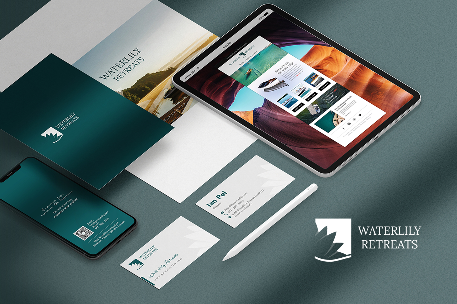
Waterlily Retreats was an early-stage short-term and vacation-rental business. I joined the small marketing team as a Junior Designer and helped translate the initial business idea into a coherent visual direction and a practical set of customer-facing materials.
The work began with the brand identity and extended across the website, roll-up banners, flyers, business cards, and email marketing. Carrying the same visual concept across these touchpoints gave the team a consistent way to introduce the business as it moved toward launch.
BUSINESS OPPORTUNITY
An early business concept needed a clear identity before it could be introduced to customers and stakeholders.
The direction needed to feel minimalist, connect clearly to the name Waterlily, and work consistently across digital and printed materials.
My responsibility was not limited to producing isolated graphics. I helped move the idea through a connected sequence from business concept to practical launch materials.
Business idea→brand concept→art direction→customer-facing touchpoints→launch materials
CREATIVE DIRECTION
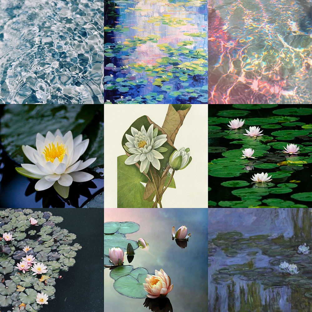
I began with two visual elements connected to the name and the retreat experience: the waterlily flower and the movement of a wave.
These references established a calm, nature-led direction that could connect the rental experience with a recognizable brand concept.
ART DIRECTION AND BRAND SYSTEM
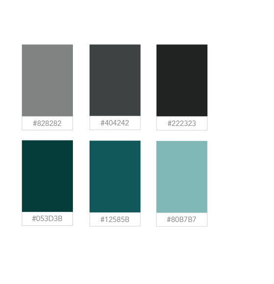
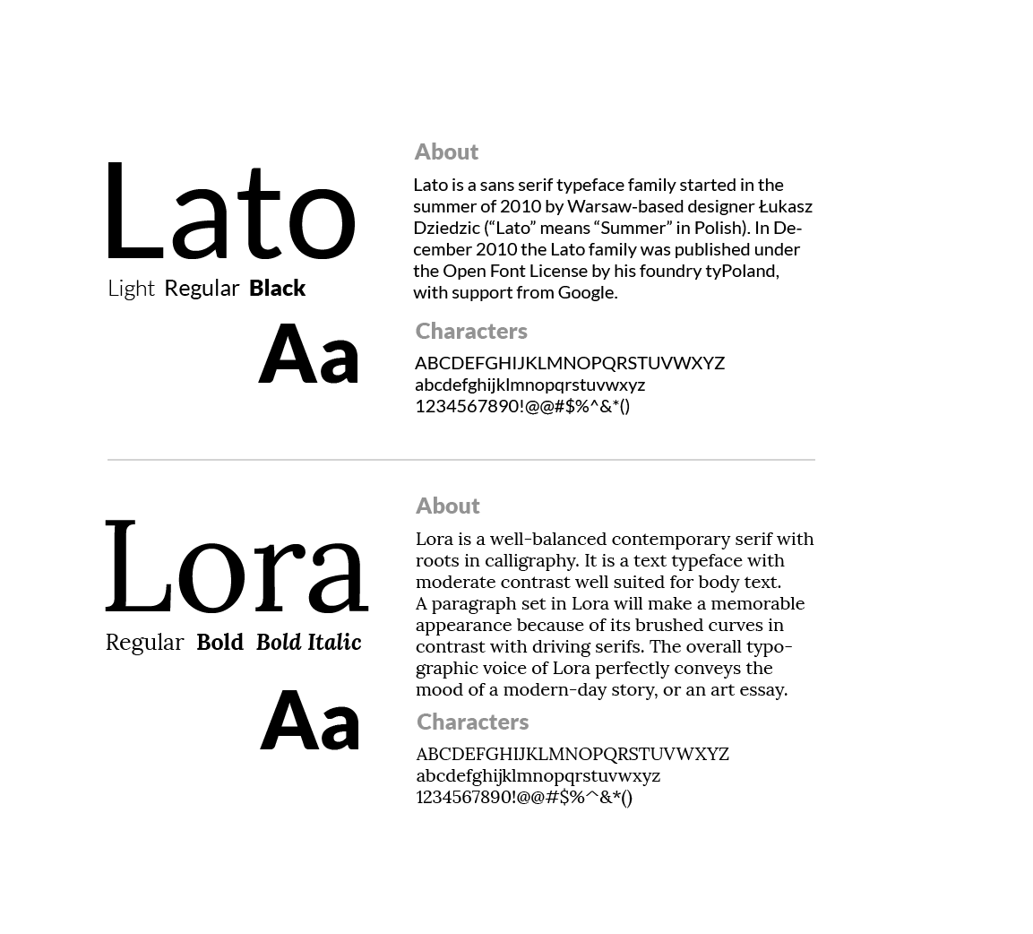
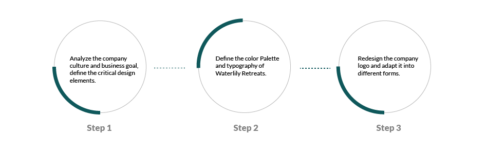
After establishing the core idea, I selected a restrained palette of greys and blue-greens and paired Lato with Lora. The combination supported a clean, contemporary presentation while retaining a softer editorial quality for the travel and retreat context.
The process moved from visual references into a repeatable direction for the identity and its customer-facing applications.
LOGO DEVELOPMENT
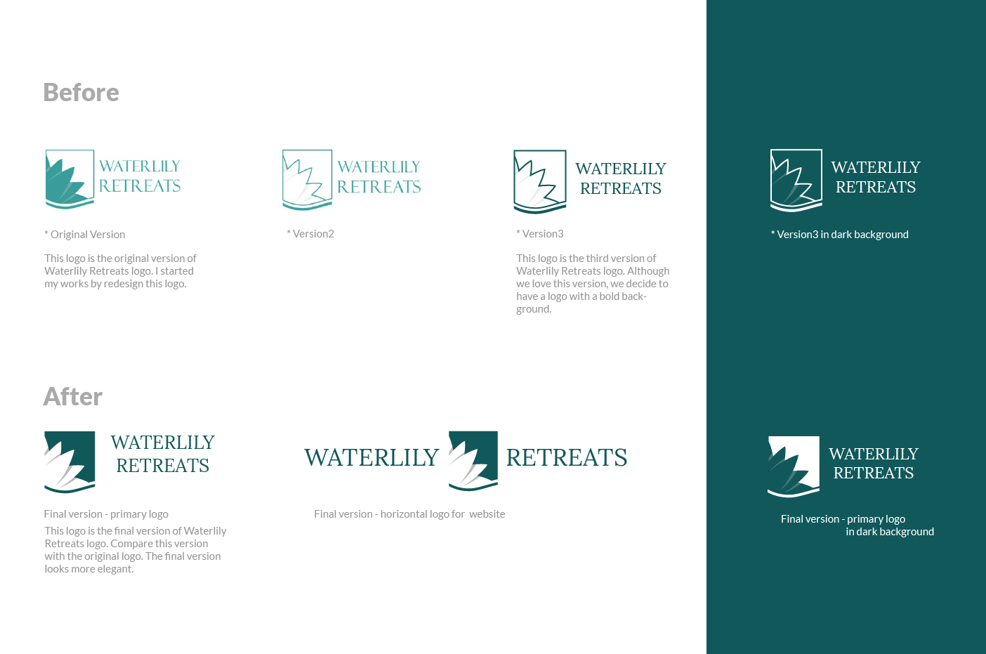
I redesigned the company logo and adapted it into different forms. After several meetings with the stakeholder, the team selected the third direction.
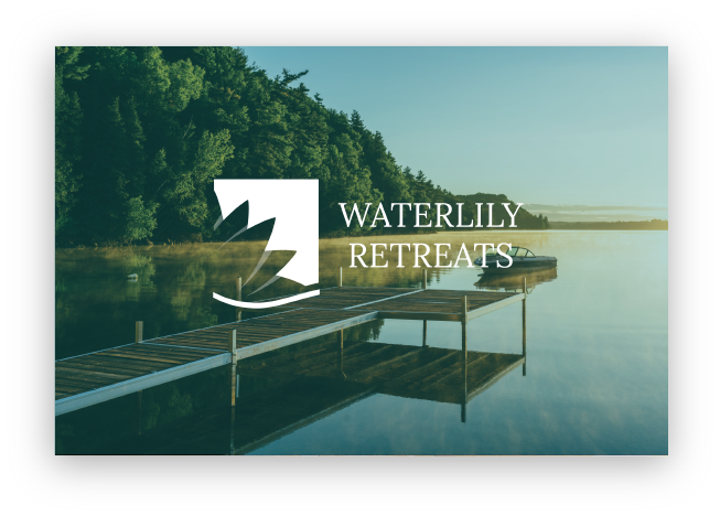
The final system included horizontal and stacked variations that could work across both digital and printed formats.
APPLYING THE DIRECTION ACROSS TOUCHPOINTS
The brand direction became a shared visual foundation rather than a single logo treatment.
The same palette, typography, imagery, and waterlily motif carried across the website, email communication, event banners, flyers, and business cards.
This consistency helped turn the early concept into a customer-facing business presence that the team could use during launch.
WEBSITE AND EMAIL
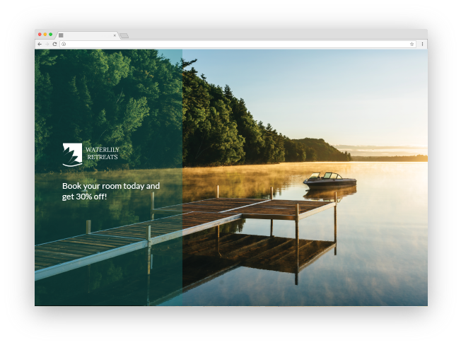
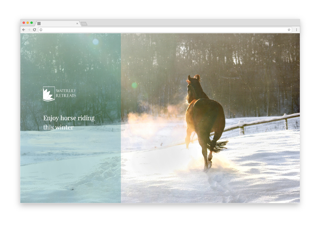
I applied the direction to website banners for different rental experiences, using destination imagery, a consistent content structure, and the same identity system.
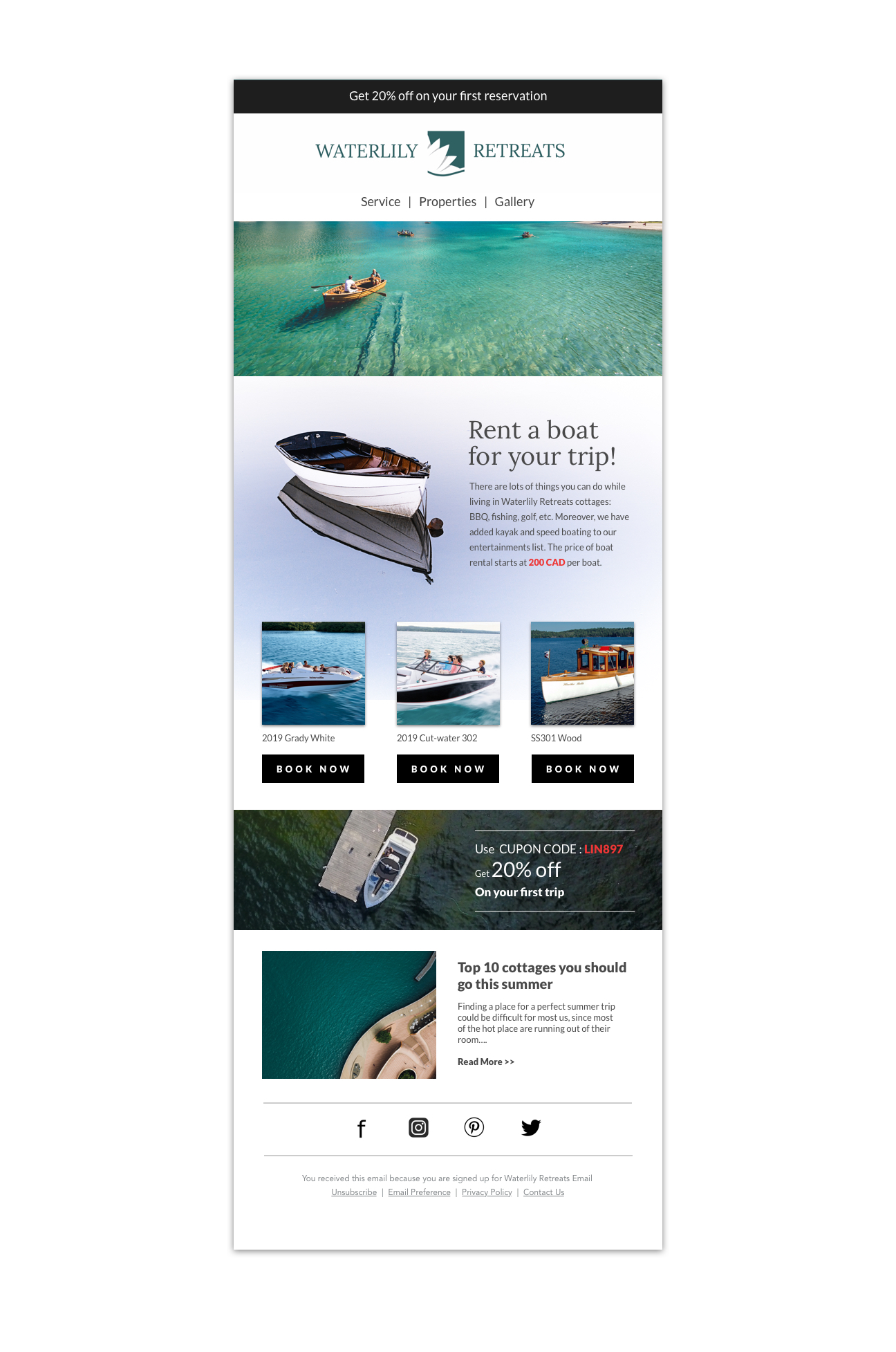
The email template extended the direction into a longer customer communication format with branded destination content and property modules.
LAUNCH MARKETING MATERIALS
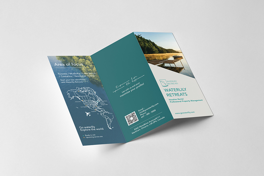
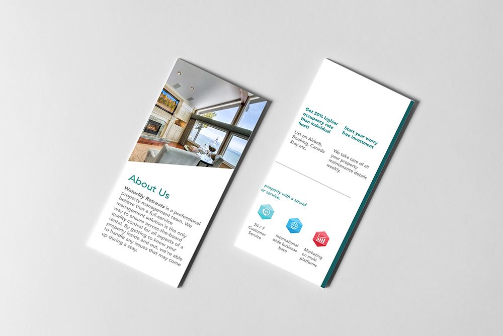
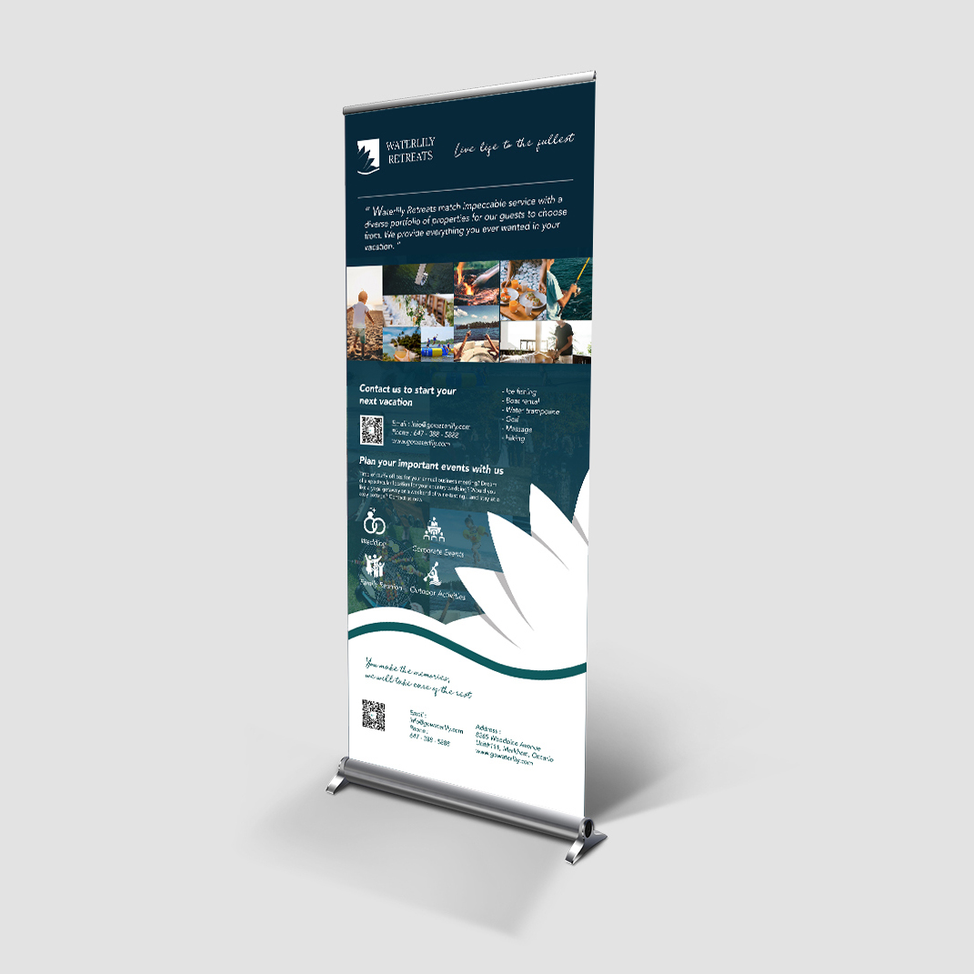
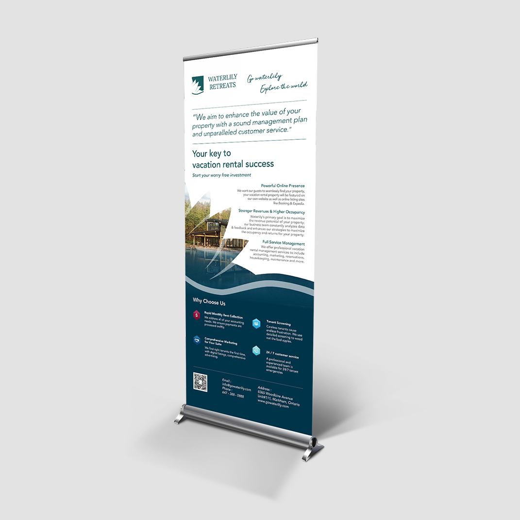
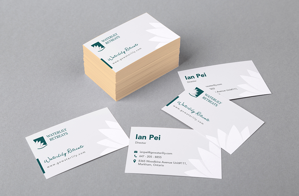
I created the printed materials needed to introduce the business in customer-facing and promotional settings. Each application used the same identity while adapting to a different format and communication need.
Three-fold flyers
Roll-up banners
Business cards
LAUNCH AND BUSINESS IMPACT
The completed system gave the team a coherent way to present Waterlily Retreats to customers and business stakeholders.
The visual direction supported the business as it moved into launch and helped communicate the opportunity to investors, contributing to attracting CAD 200,000 in investment.
REFLECTION
This was an early-career project completed within a small business and marketing team. Working as a Junior Designer, I learned how a clear visual concept could connect business intent with practical execution across multiple touchpoints.
The project also gave me meaningful ownership: I developed the art direction, worked through the identity with the stakeholder, collaborated with marketing, and carried the chosen direction into the materials needed for launch.