
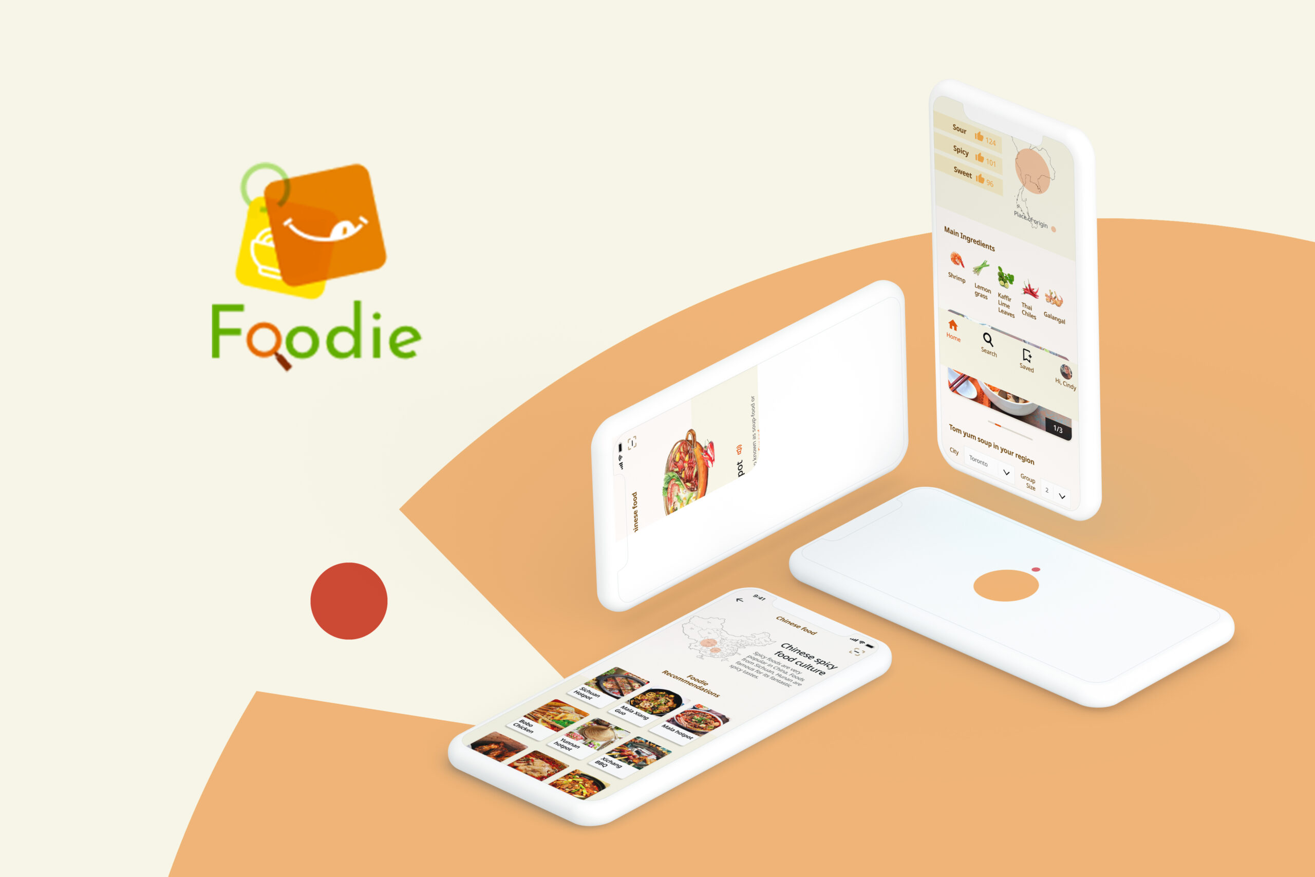
Foodie
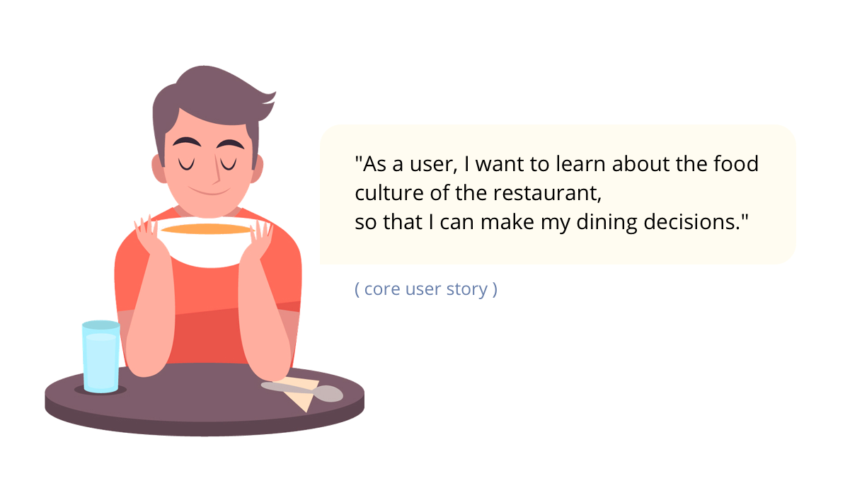
Foodie aims to improve individuals' dining experience in ethnic restaurants by removing language and cultural barriers. It helps the users quickly learn about the worldwide cuisine and the authentic dining manners, food culture.
Project type: School project
My role: Product Designer
Duration: 10 weeks.
Tools: Invision, Figma, Sketch, Photoshop, illustrator
( Click to navigate the prototype )
Problem Space
Nowadays, Canadians are living in an era in which people are embracing the diverse culture. There are thousands of foreign cuisines in Toronto, and their delicious foods attract individuals from different cultural backgrounds.
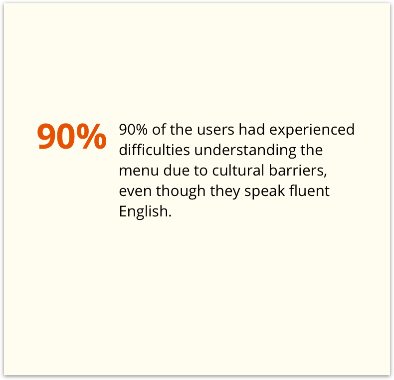
It is crucial to notice that many individuals misunderstand the ethnic restaurant menus and food cultures due to language barriers.
"How might we help individuals who have a hard time understand the foreign cuisine overcome the language barriers and understand the content of the dishes so that they are confident to order anything from an ethnic restaurant?”
Secondary research
To learn more about my problem space, I’ve conducted some secondary researches about the current restaurant industry. This research plays a crucial role in understanding the problem and helps me think about the specific situation I was going to solve.
These three cards show some interesting insights into restaurant customers’ behavior.
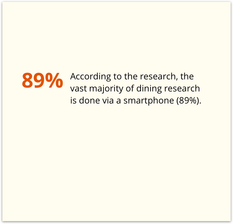
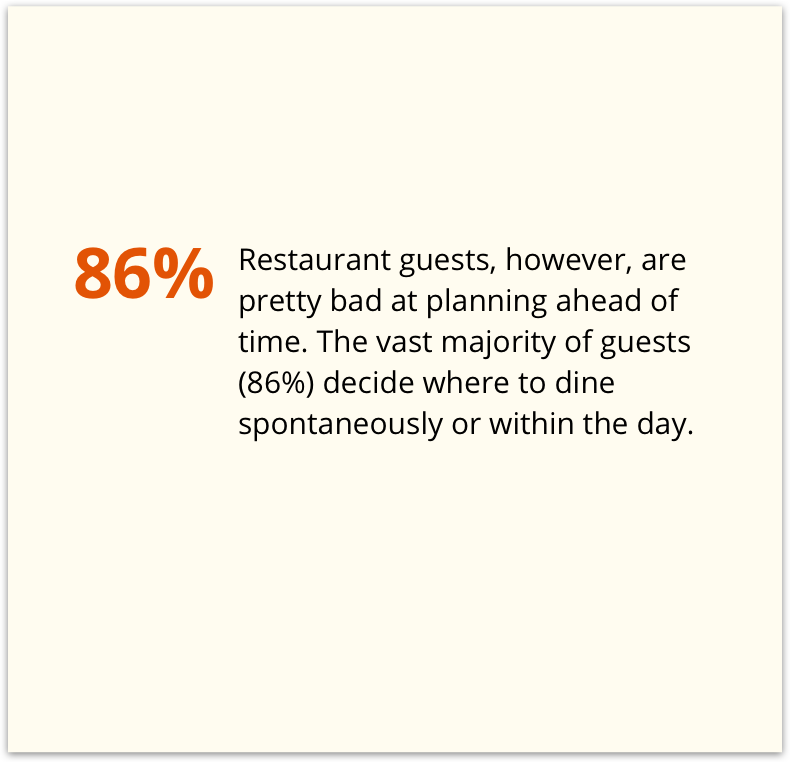
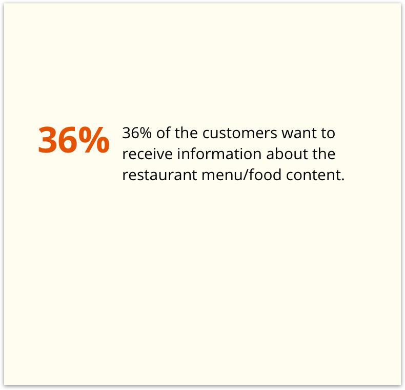
To summarize, restaurant customers are likely to use their phones to researching restaurant information and their menus online when they want to dine out. Thus, there are opportunities where mobile apps or responsive web applications could intervene to help the customers.
Key research insights
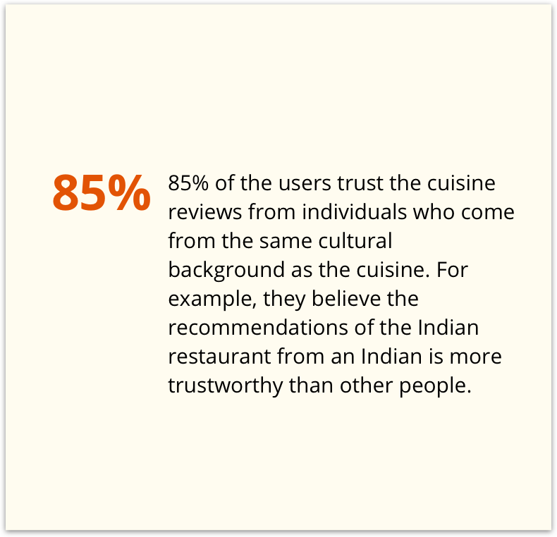
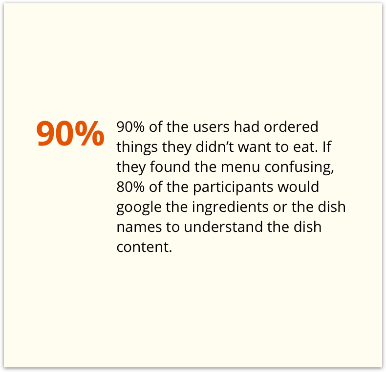
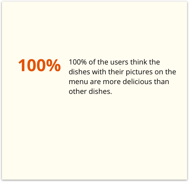
The research shows that restaurant customers would search for cuisine information online before dining out. However, I was curious how they are attracted by ethnic cuisines and understand them because it is hard for people to accept new things. Therefore, I’ve conducted user research with ten people to understand their process of reaching out to a new ethnic restaurant and their dining experience in those restaurants.
Specifically, the participants of the research are adults age between 20 - 40 who love exploring ethnic foods. They are familiar with smartphones and search engines.
The research insights show…
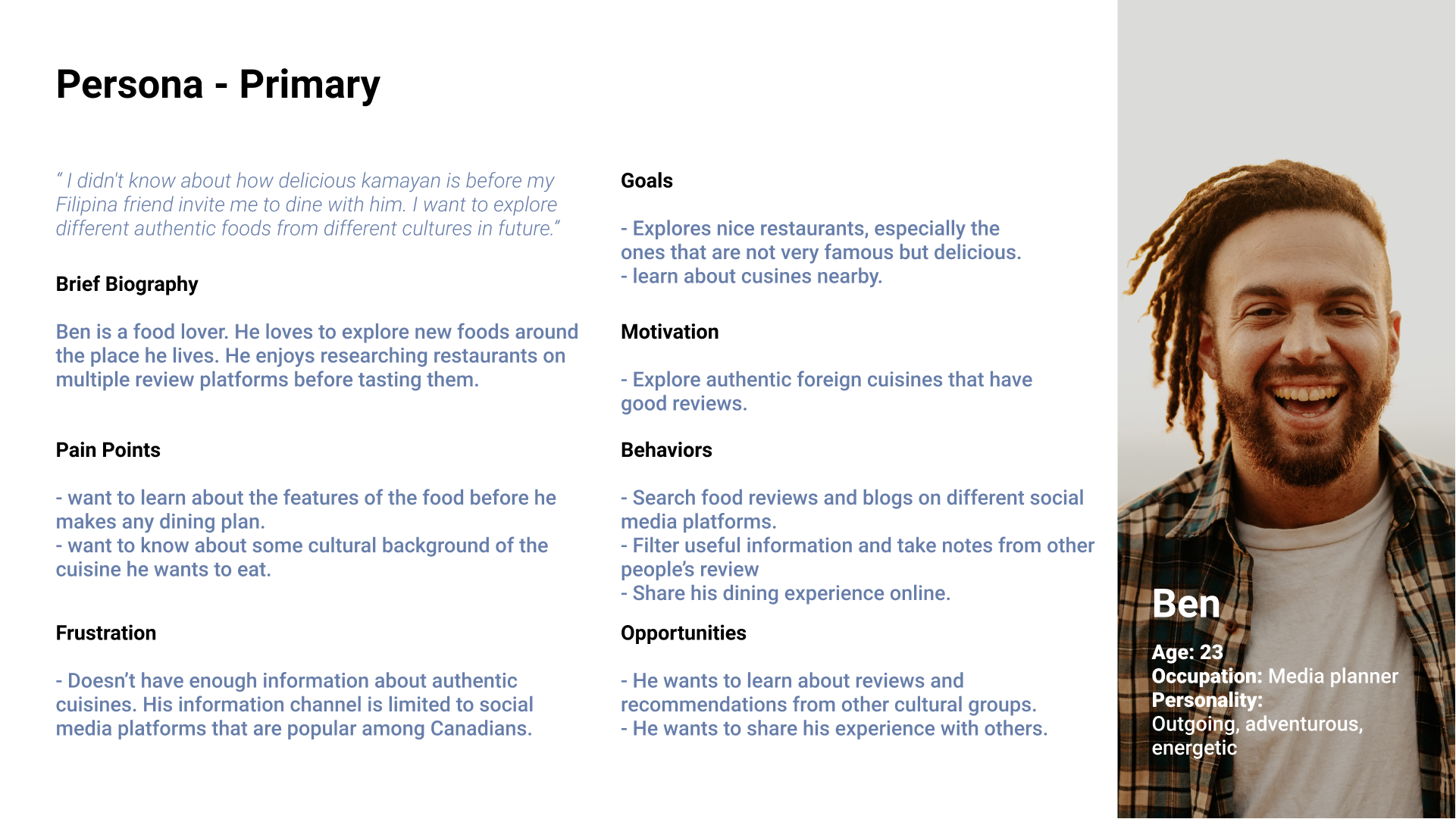
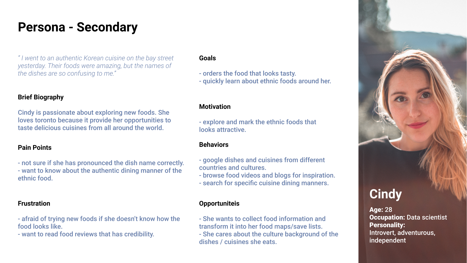
Persona
Based on the secondary research and user research, I’ve created two user personas to learn more about my significant users. Also, I was able to empathy with the customers’ thinkings and feelings, by illustrating the primary and secondary personas
In addition, I crafted an experience map of a user’s experience of dining in an ethnic restaurant.
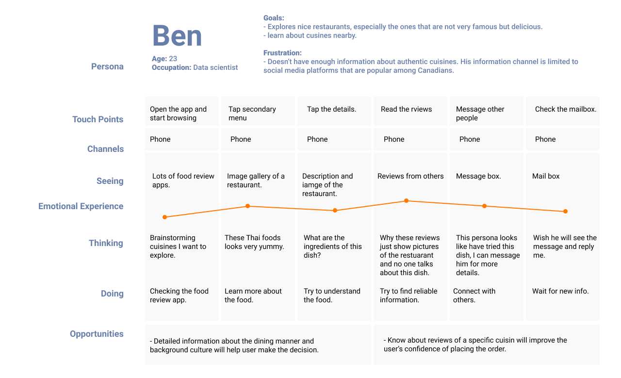
After reviewing the personas and experience map, it is clear that “language barriers” and “cultural background” are two key issues affecting customers’ dining experience in ethnic restaurants.
Therefore, I refined my problem space...
Refined problem space:
“ How might we help individuals who have a hard time understanding foreign cuisine overcome the language and cultural barriers and understand the content of the dishes, so that they could quickly learn about the food culture of the restaurant?”

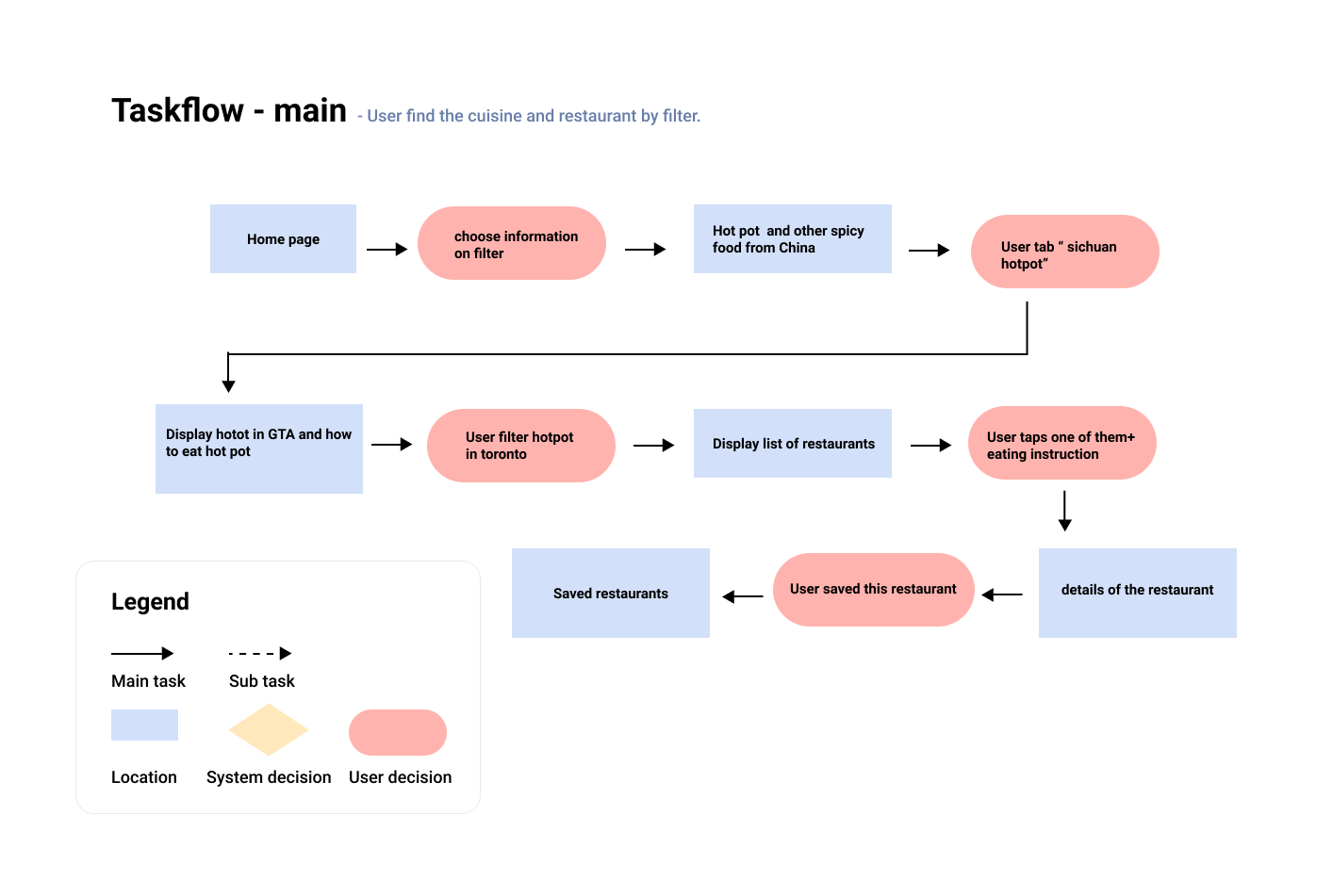
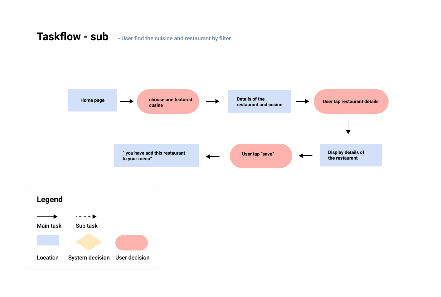
Task selection process
Based on the HMV and considering the user experience, I wrote 30+ user stories to explore the epics that define this product's functions. Taking the main value proposition into consideration, I choose the following epic and user stories to develop the minimum viable product(MVP).
Core Value Proposition: To help users remove the cultural and language barriers.
Core Epic: Understand the food
User stories
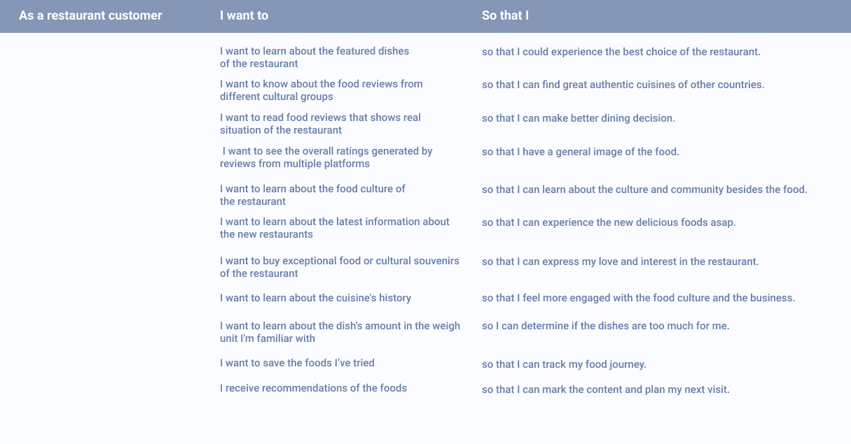
The user stories suggest the main task flow of my product - the process of a user learn about ethnic food and decide to dine in.
Ideation
Once I was evident with the primary task flow and user stories, I realize that photos, videos, explore buttons, and options filters are basic patterns of my design. Because digital media always do a better job than texts in demonstrating foods. Moreover, since this app's primary function is to help the user understand new cultures and new foods, I decided to look at travel and dining apps like Airbnb, Expedia, Yelp, and Yummly for inspiration.
( Inspiration board )
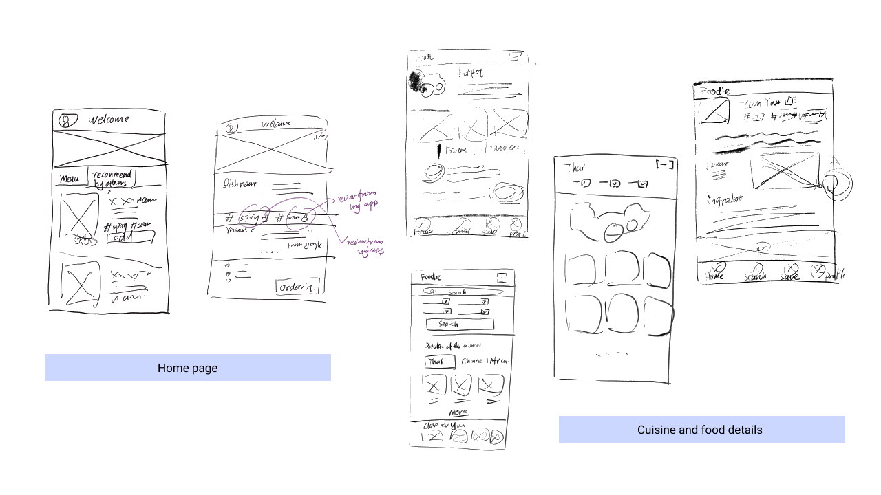
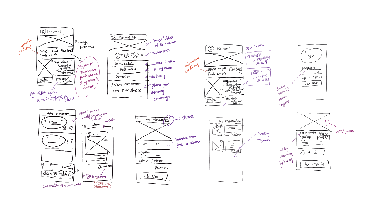
After having some inspirations, I started brainstorming and sketching my design ideas. The following images show some of my sketch drafts.
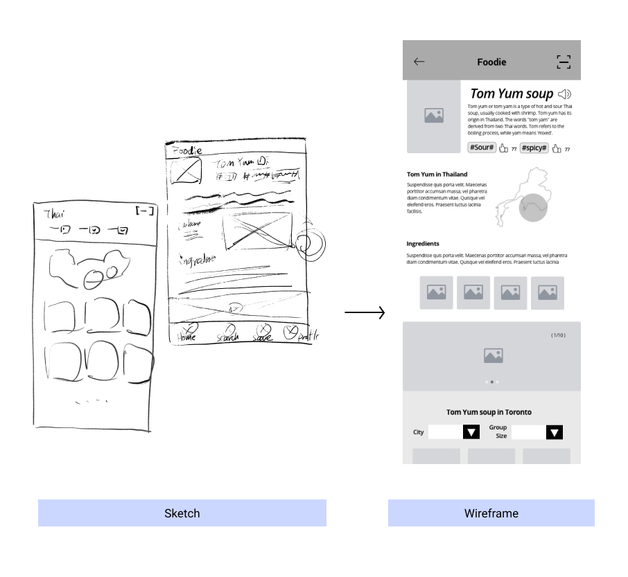
Wireframe and prototype
I went through different versions of the design to develop thepaper sketch to digital wireframes. The image below shows the wireframe flow of my product.
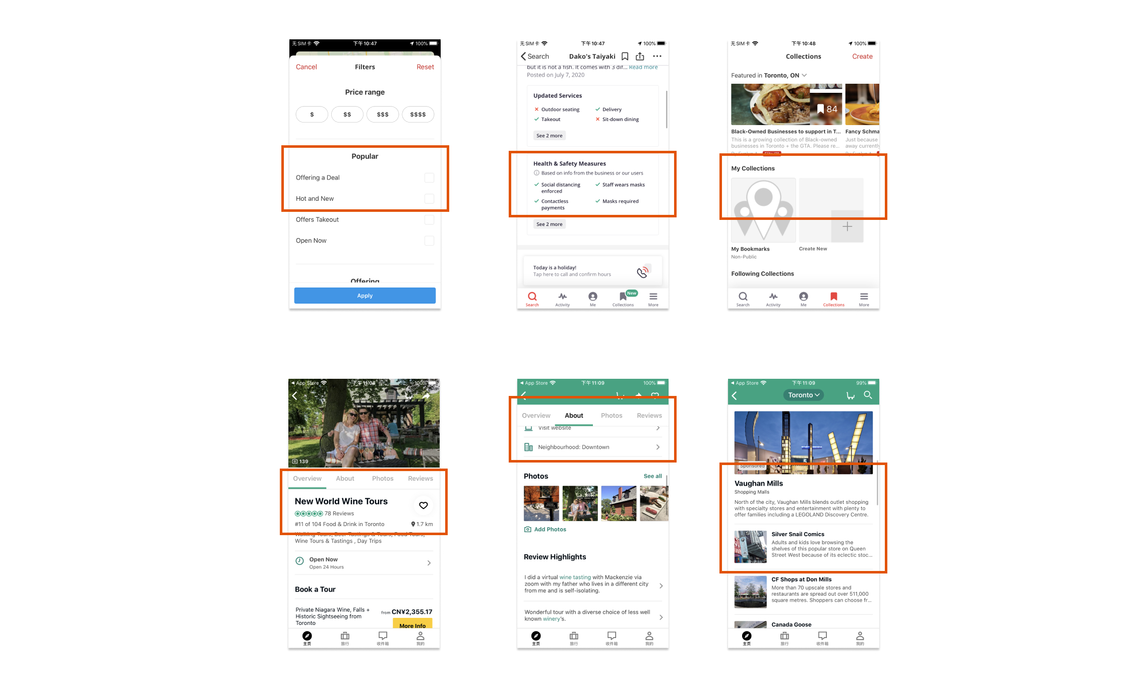
Usability test
I conducted 2 rounds of usability tests with 10 people. There were 5 participants in each round, and each of them was given 3 tasks to complete.
The usability test is one of the critical parts of my product design experience as it helps me learn more about the needs that users didn't mention in words. I intentionally paid extra attention to users' mouse movements and their moods. Those details and my test notes on each round of the usability tests provide me supportive information for the next iterations.

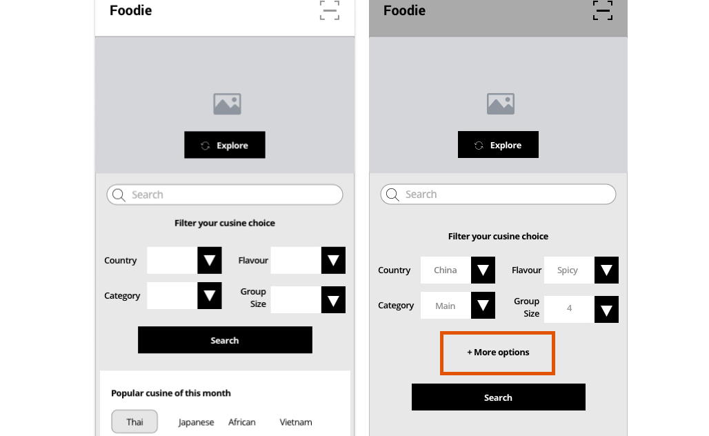
Notable changes
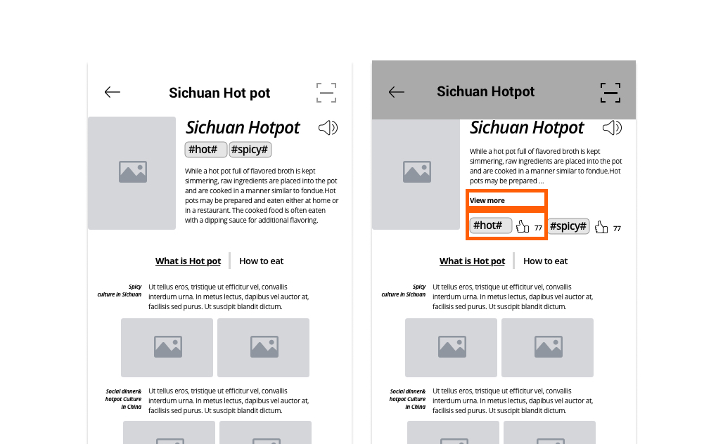
Change1+2 - Location: the cuisine introduction page:
“ I don’t want to read too many details of the cuisine if I was not that interested.”
My insights from the test feedbacks:
The cuisine details page is the key page where users getting to know about ethnic cuisine and restaurants. According to the user's feedback, the design of this page is too text-heavy. Therefore, it is important to think about “how to help users understand the food as fast as possible with fewer texts.”
The changes:
Change1 - Add the " View more " button, so that users have the freedom to choose to read more content or not.
Change2 - Add the number of "likes" to each hashtag. This feature will demonstrate the reliability of the food reviews.
Change3 - Iterate the homepage:
“ I want to search for cuisines by flavor and ingredients.”
My insight:
The usability test feedbacks indicated the fact that users are creative in exploring new foods. They care about the place of origin, group size, flavor, etc. It is better to provide users the freedom to customize their research experience by providing more searching options than limit their food research experience to four search bars.
The changes:
Chang3 - Add "+More options" button. This feature help users to choose the filter options they want to use.
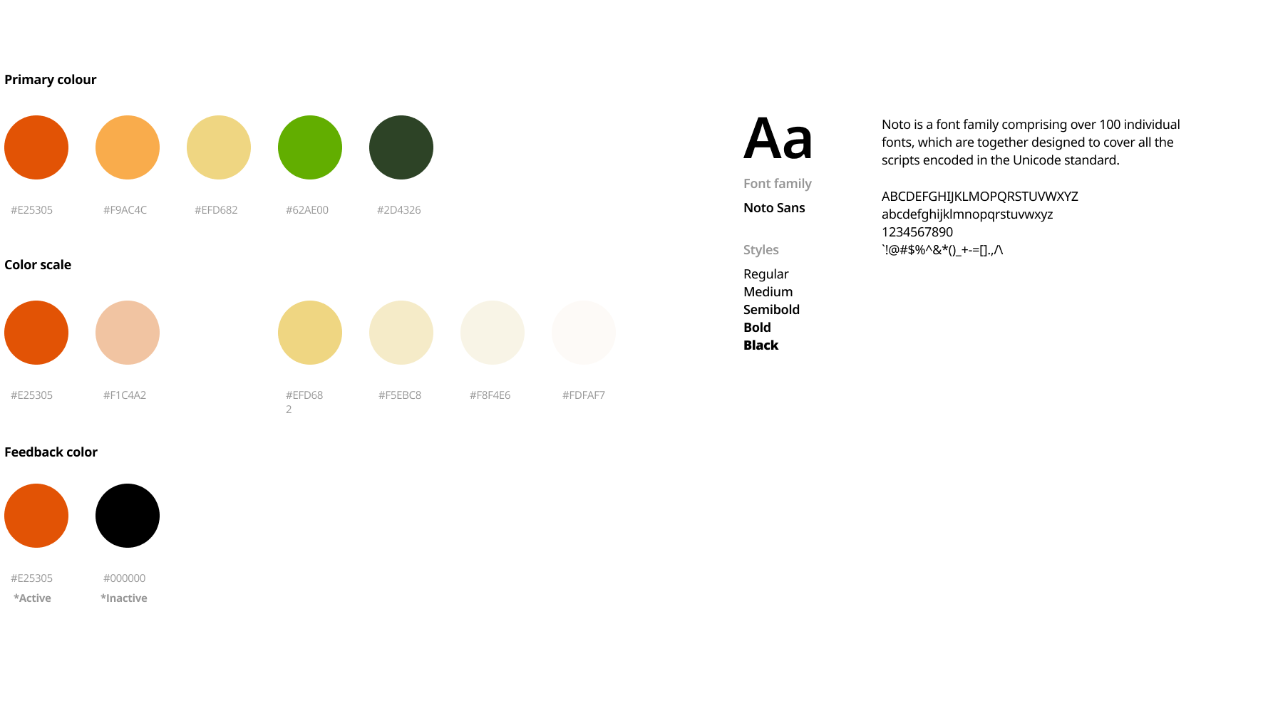
Visual identity
Great user experience includes engaging visual designs. After created the wireframes for my product, I started to explore the visual identity of my product.
First of all, I took a look at my user persona, and it is clear there are some key traits and elements from it:
- Journey
- Exploration
- Ethnic culture
- Travel
- Diverse food culture around the world
Moreover, I also reviewed the value proposition of the product:
- To help users remove the cultural and language barriers.
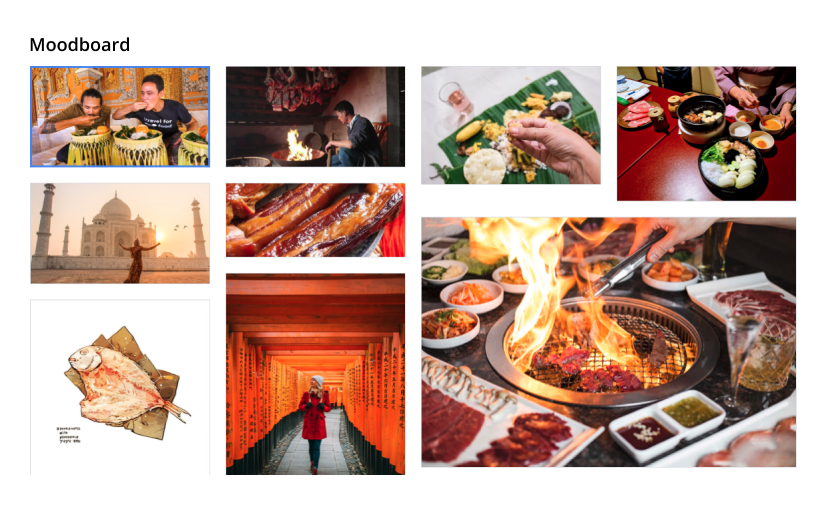
Therefore, I decided to create the mood board with four keywords:
- Food
- Travel
- Ethnic culture
- Passion
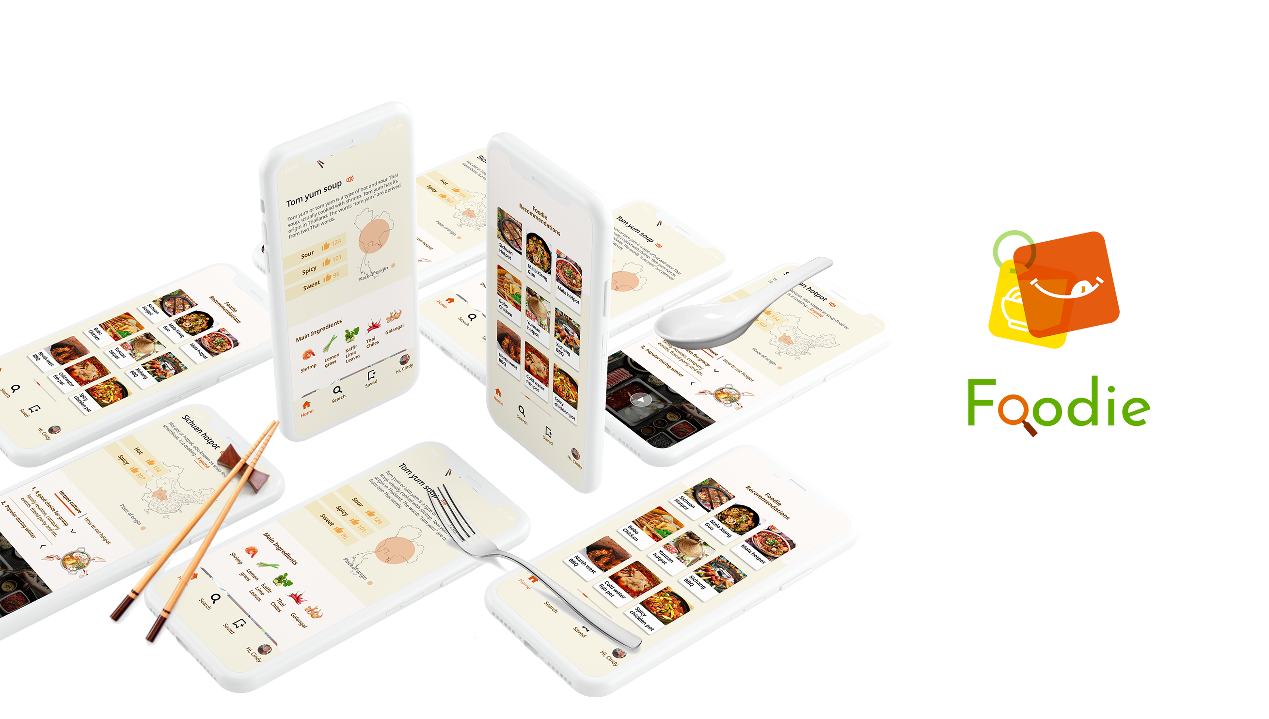
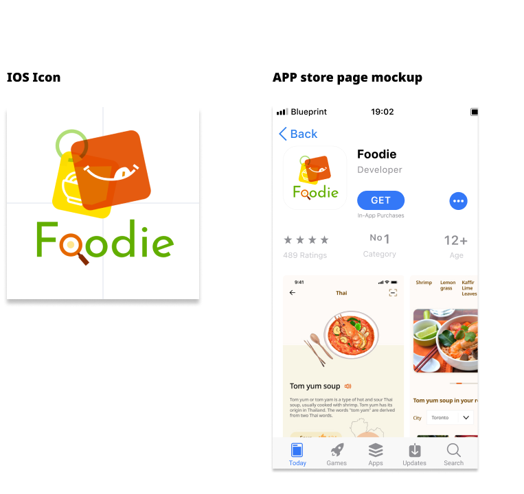
App Store and iPhone screen preview
Creative Details
Icons, loading animations, and illustrations are an important place that demonstrates outstanding visual details of the app. Thus I decided to add some animations to the onboarding page and loading page which helps users feel more engaged with the product.
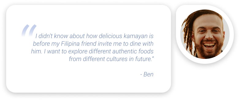
Reconsidering the primary user persona:
“Ben is a food lover. He loves to explore new foods around the place he lives. He enjoys researching restaurants on multiple review platforms before tasting them. “
It is clear that exploring foods is a happy and relaxing event for Ben. Instead of using food as a loading animation theme. I believe icons like “ eating dots” look more attractive and relaxing. “Eating dots” also indicate the passion for eating.
Mockup
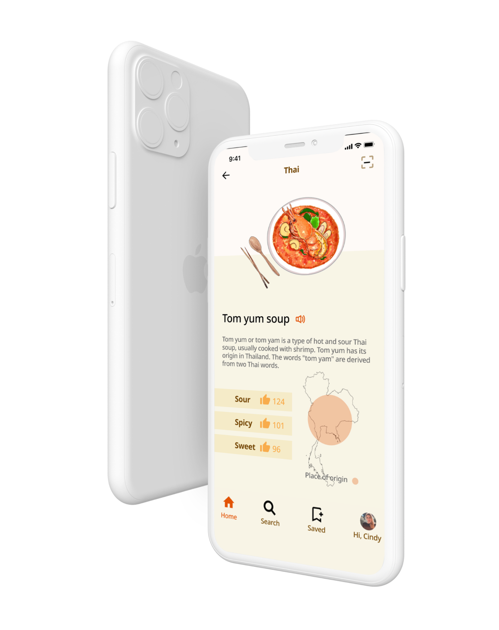
Let’s put things together. Click the button below to view the prototype of Foodie.
The marketing website
This site aims to promote the product. Users will be directed to the app store if they click the CTA buttons.
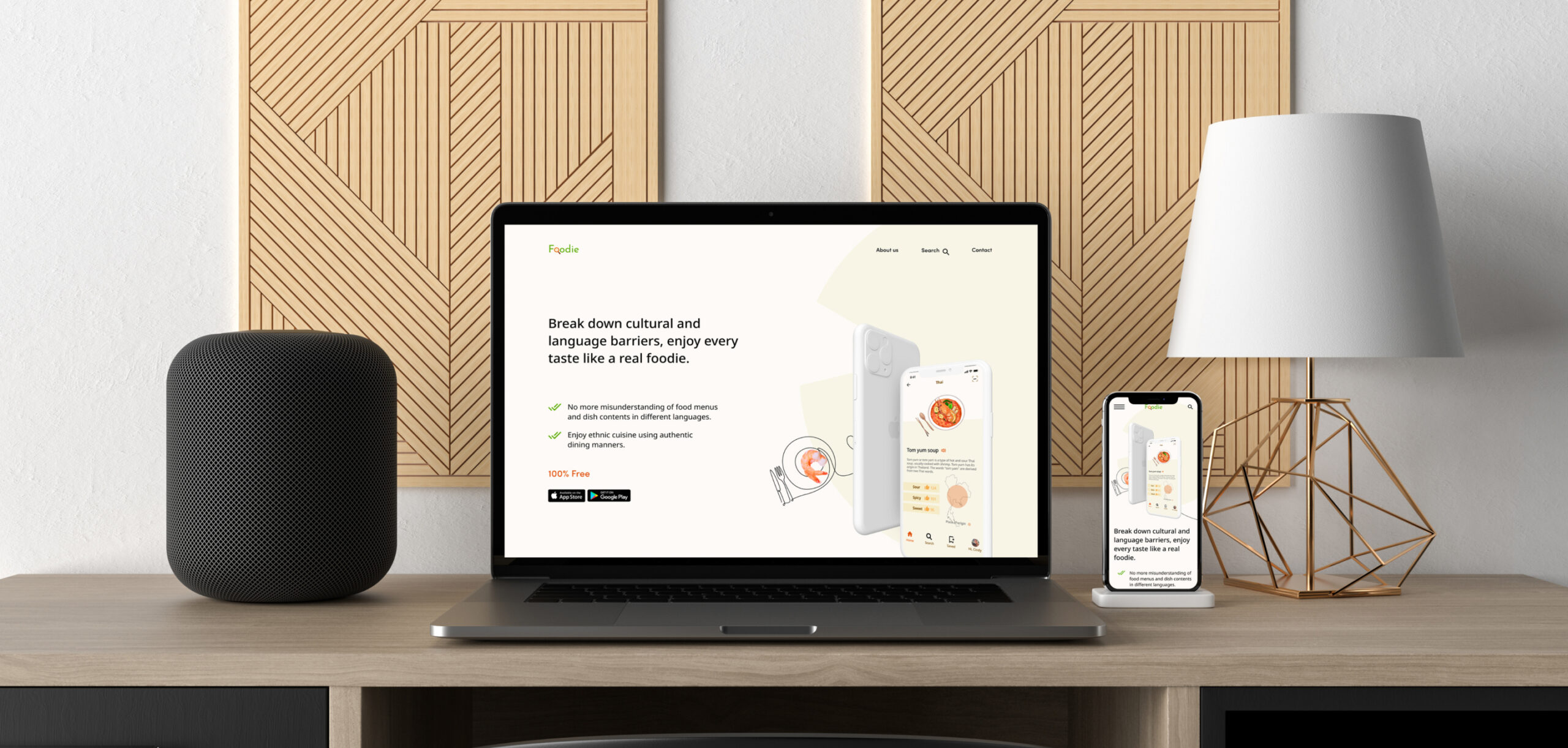
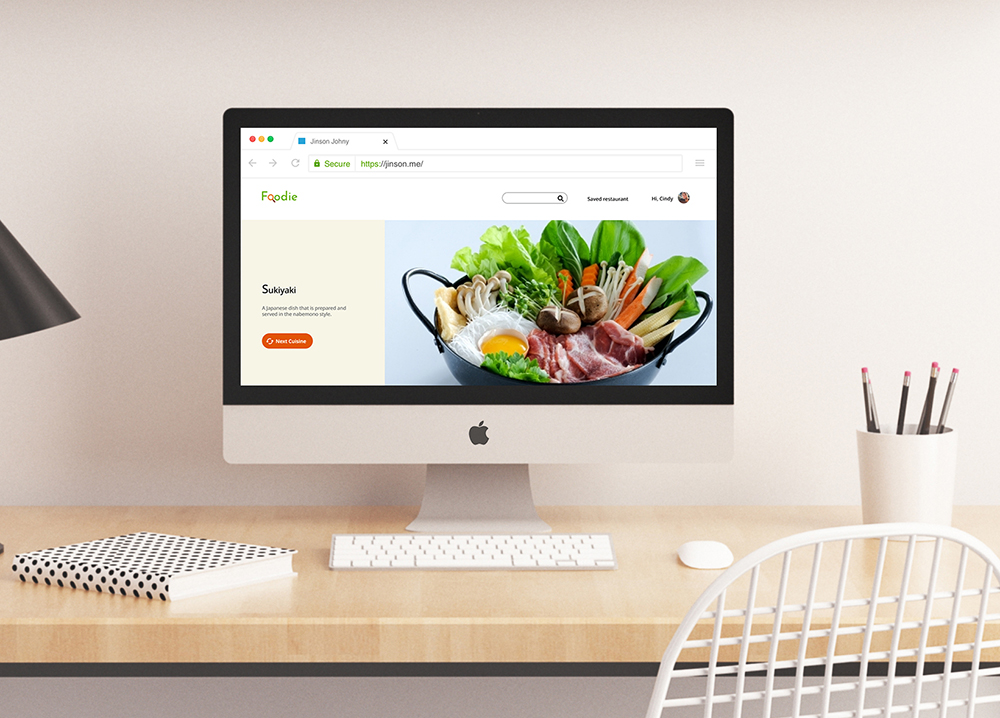
Product adaption to the web application
Users might want to use Foodie on the desktop because this product is a powerful tool that travelers will use to explore cuisines along their journeys.
Design Impact & Future Thinking
What would happen if there are 100 million people subscribed to my product?
Foodie is designed for true food lovers. If there are 100 million foodies subscribed to this app, I believe this app will help lots of users exploring delicious ethnic foods that are not famous internationally. As a result, the users will have more dining choices and a better understanding of foods. Also, there will be less misunderstanding, discrimination, and stereotypes of different cultures.

Interested in working together? Get in touch!
Selected Works
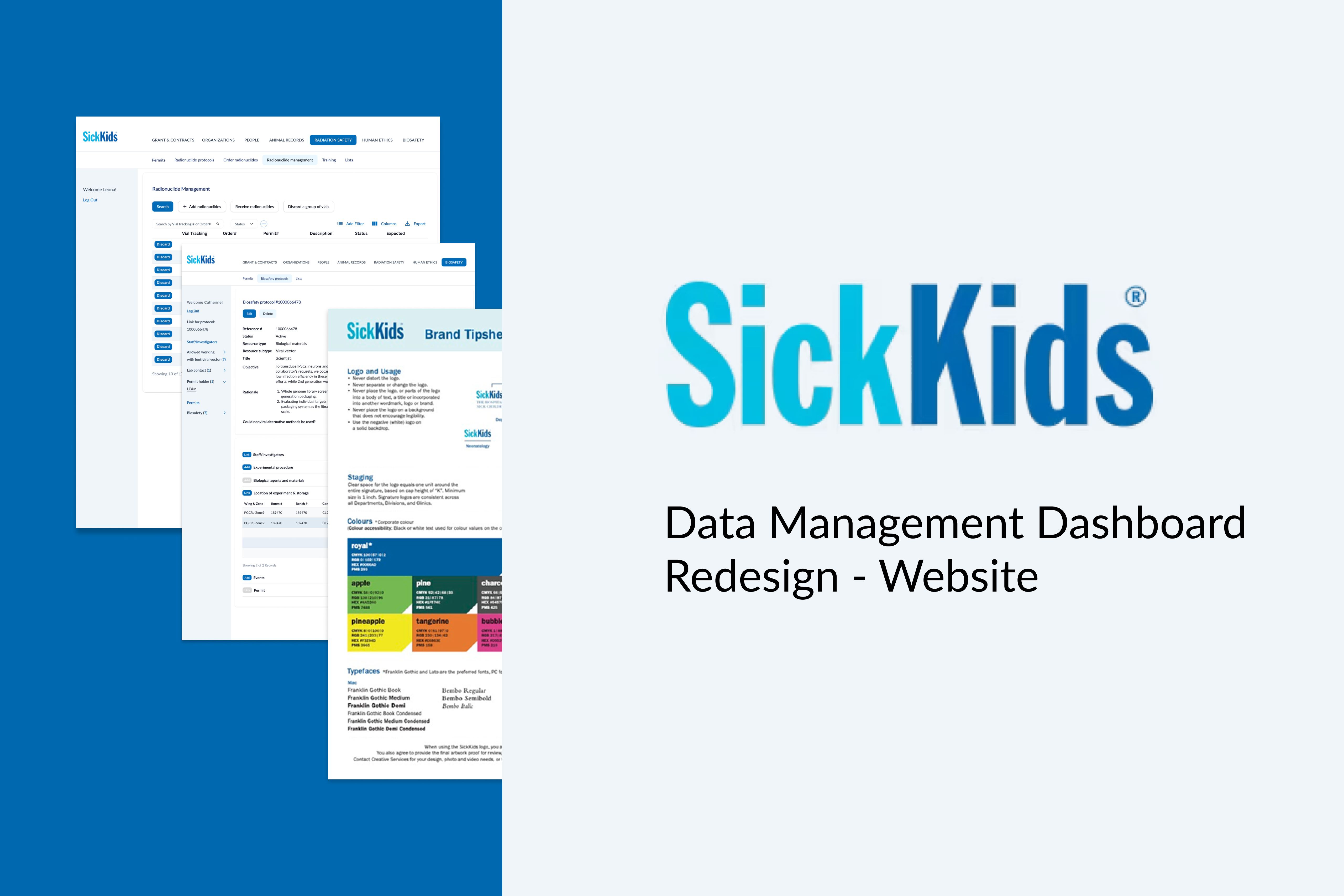
SickKidsWeb design

Canadian tireWeb design
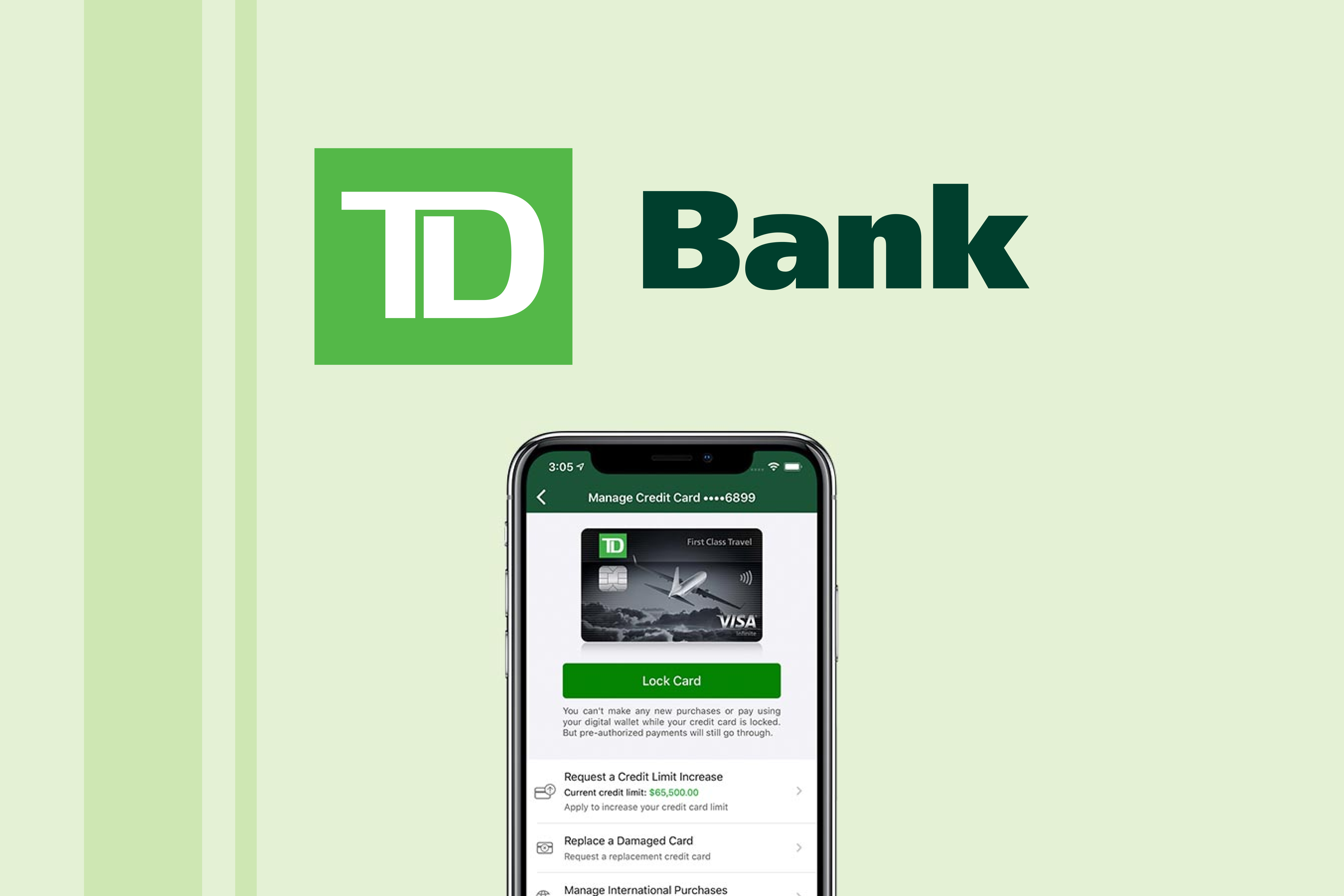
TD bankApp design
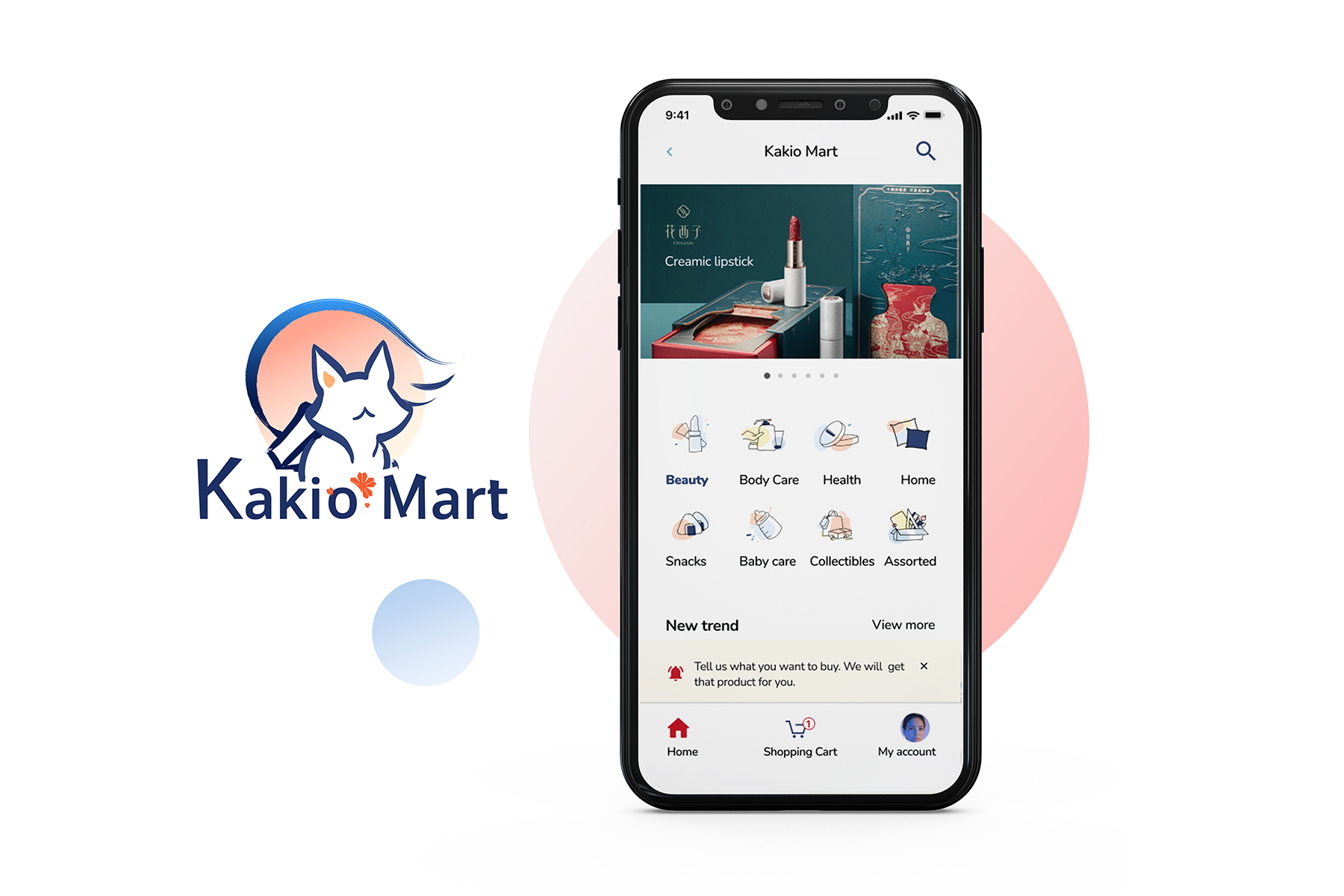
Kakio martApp design
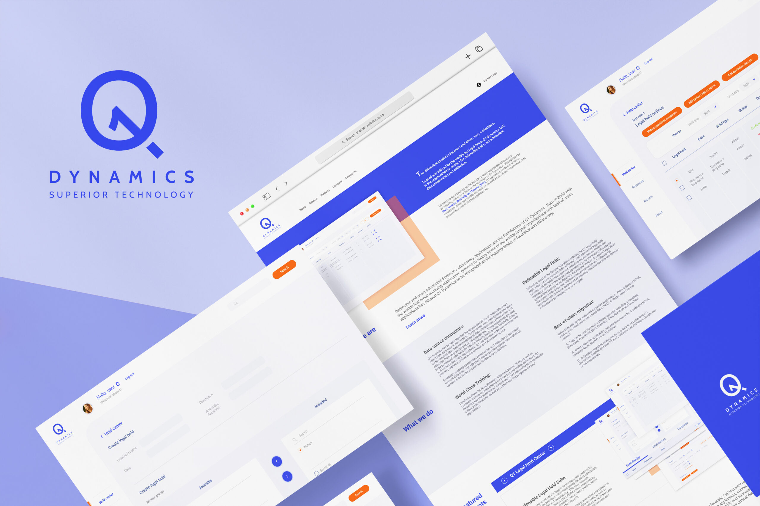
Q1 dynamicsSaaS design
FoodieApp concept design
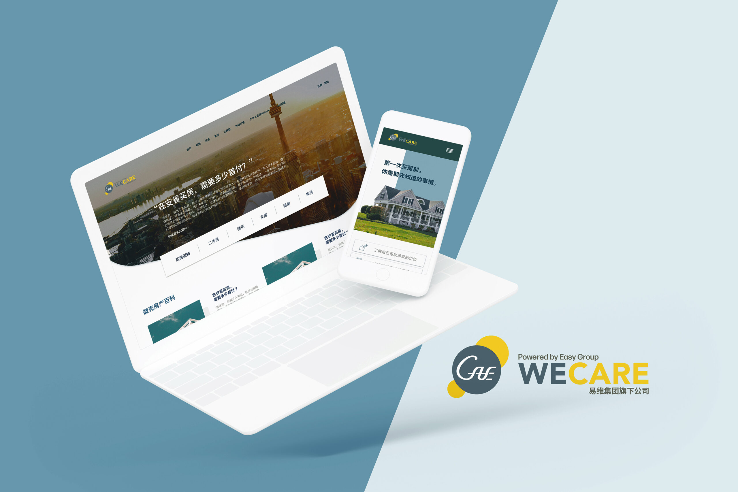
WeCare Real estateWeb design
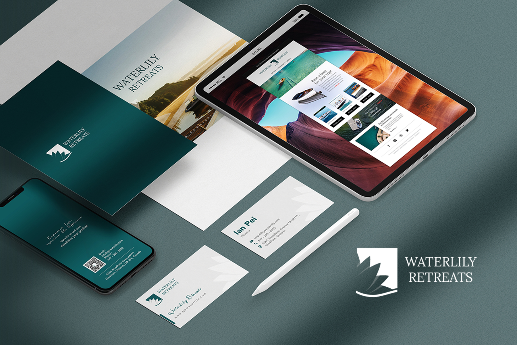
Waterlily retreatsVisual design